


01 · Legacy
A homepage working against itself
A tall single-column page. Product links sat far below the fold in an interlink widget, p-tagged rather than headed, so crawlers read a weak signal and click-through stayed low. The most valuable real estate carried the least SEO weight.


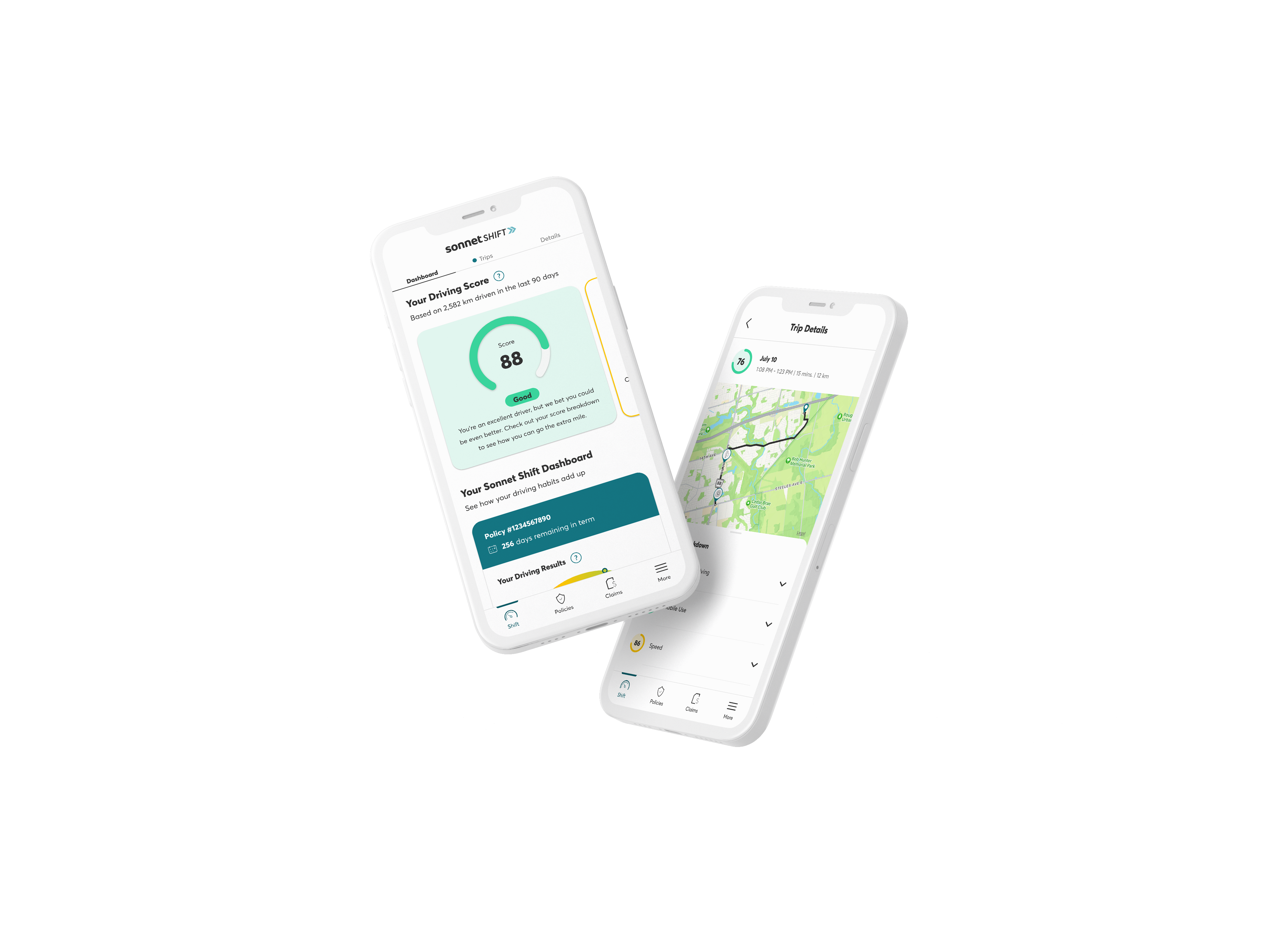
↑ The inherited sonnet.ca homepage, scroll the frame. The hero fills the viewport, and the p-tagged product links sit far below in an interlink widget.
02 · The problem
Most visitors never reached the products
Most pageviews never reached the product content. That reframed the brief: design for where users already are, above the median fold.
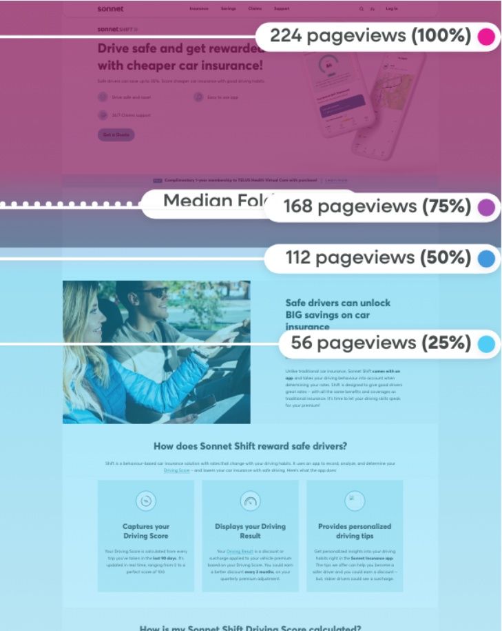
↑ Pageviews drop by about three quarters before the product content. Bands mark where each share of sessions stops.
Design for
where users actually are,
not where we want them to be.
03 · The negotiation
Four forces, one hero
SEO wanted a keyword-eligible H1 and crawlable H4 links, but those keywords didn't speak to our segments. Brand wanted "Adulting is hard. Sonnet is simple.", warmth the SEO copy kept fighting against.
The CMS needed one spec both DotCMS and the incoming AEM could render. EN / FR parity meant every layout had to hold in French, which runs about 20% longer. The design is the negotiation between all four.
Dev joined at the sketch stage, so feasibility shaped the concepts instead of vetoing them later. Then alignment, hi-fi at three breakpoints, hand-off, tracking.
Dev sat in the sketch loop, so feasibility shaped the concepts instead of vetoing them at hand-off.
04 · Product cycle
Where this page sits, and why mobile decides it
The hero owns the first stage of the funnel: acquisition. Half of those sessions arrive on a phone, and half of the quotes start there too, so the 375px viewport sets the constraints for everything that follows.
Full-funnel product cycle
The hero only wins the first stage. Results in section 07.
Why mobile-first
50% of users were browsing and starting a quote on mobile, so mobile carries the first two stages of the cycle, not just the landing.
5.4K users, past 30 days, by device.
05 · Three directions and lo-fi
Each option paid a different price
Three ways to balance keyword coverage, brand voice and above-the-fold discoverability.
A, Full-height hero
Maximum brand impact, but it pushed the product tiles below the fold. Killed by the scroll data.
B, Segmented hero
Better balance of brand and products, but busy and hard to hold across breakpoints.
C, Shorter hero + featured products
SEO-eligible H1, full product row above the fold, buildable in both CMS platforms.
Each frame is cropped at its own median fold and drawn at true relative width, so 375 reads as 375 next to 1440. Headline, tiles and CTA hold above the fold at every width.
The annotated concept, fluid type, overlay, link structure, and the median fold marked on every comp.
06 · Hi-fi
Left justified, or centred
Two treatments of the same structure, tested against the fold.
A · Left justified, specs and annotations
Every callout marks a slot the CMS owns, so marketing can change copy or retire the promo bar without a build. Please note that the images are placeholders. In mobile viewport, hero image is optional.
Optional logo lockup
Resized <H2> tag
Enticing catchphrase
Resized <H1> tag
vh / vw scaling
Body text
Optional Trustpilot
Four variations
<H3>
Redirection to product pages





B · Centred
375
Build, deferred to the AEM migration
Both were pushed to the AEM migration once the effort estimate came in, and are in that process now. The spec carries forward so either can ship on the new platform. French localization proved the fluid H1 holds with longer strings.
07 · Post-launch
The numbers, and what's still open
The ranking gain is the one I'd stand behind most, the CTR range is real but flattered by how little the old widget was clicked.
↑8.2%
Engagement time
Users spending 20 seconds longer per visit
↑19 pts
SEO gains
Tenant insurance ranking up 19 points
↑up to168%
CTR to product pages*
Indicating improved discoverability and user interest
Performance tracking period: Jun 1 to Aug 31, 2025
* CTR increase, auto +72% / tenant +168% / home +116%, off a low base since the old widget barely got clicks.
What I'd do differently
It was behavioural-data led, with no user testing. Next time I'd push for testing and province-level data, so the page can surface what a visitor is eligible for instead of inferring intent from scroll alone.
Increase session-to-start rate
SEO gains didn’t carry into the quote flow. Next experiment: an inline postal-code field in the hero, tested against the current CTA.
Improve bundled quote visibility
Bundling drives the best premiums but lived three clicks deep. The team prioritized it right after launch, and a dedicated bundle and save page now carries it.